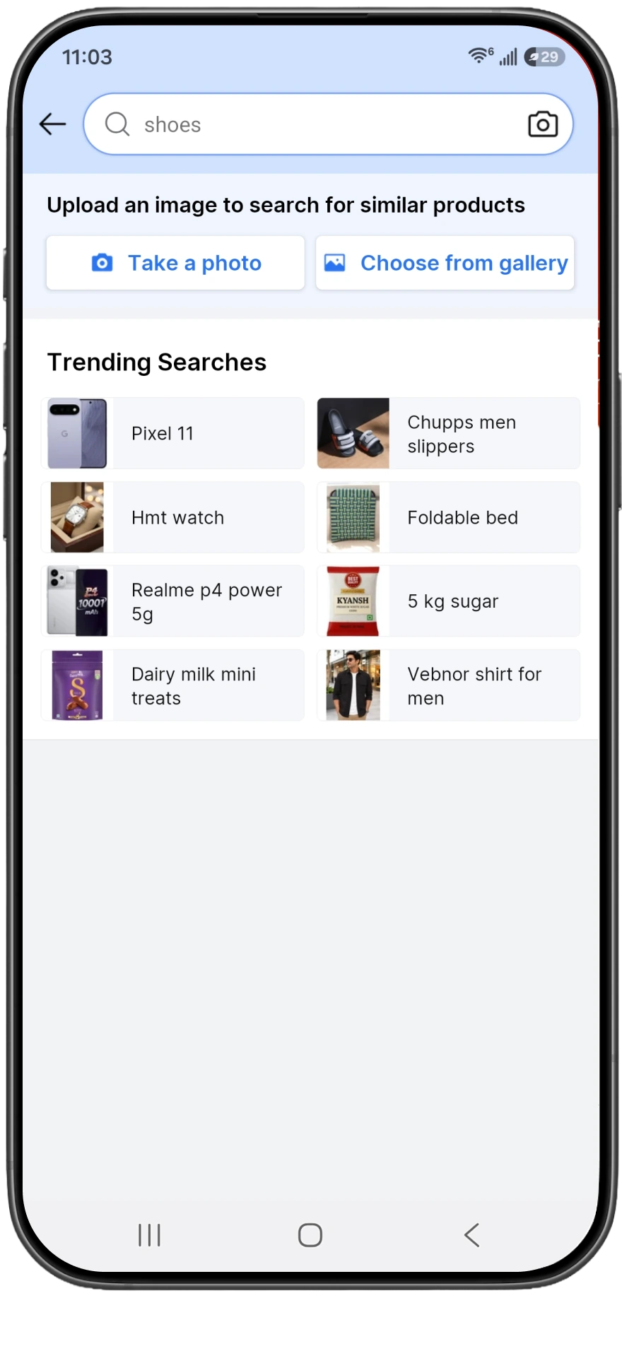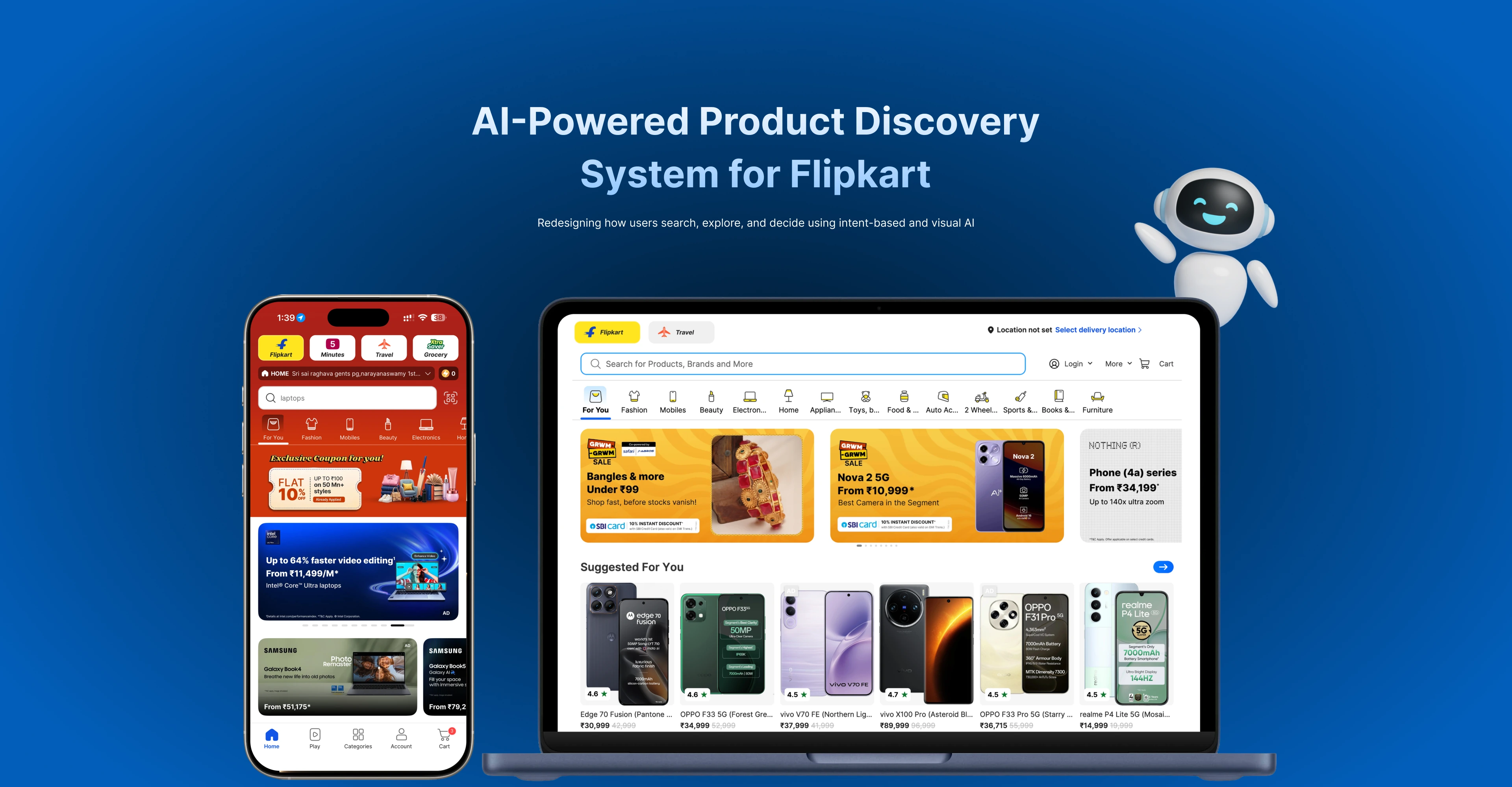
Flipkart AI-powered product discovery shown on a phone and laptop
Product Design AI Discovery 8–10 min read

From keyword search
to intent-aware discovery.

Flipkart could return thousands of products. Helping people express what they meant — then decide with confidence — was the harder product problem.

Role
Product Designer
Product
Flipkart — search & discovery
Focus
AI Search · Product Discovery · E-commerce Decision Support
Duration
8 months
Contribution
Intent-aware discovery experience — search entry → results → comparison → decision support

In short

Retrieval was never the bottleneck. Interpretation was.

Flipkart’s search could find matching products in milliseconds. What it could not do was tell someone which of those products actually answered the goal behind their query — or give them a way to settle the comparison without opening eight tabs.

The problem

People searched in goals — budget, use case, audience — but the system matched on keywords. A query like “best gaming phone under ₹30,000” returned a long, flat, unranked list where relevance was left entirely to the shopper to work out.

What I owned

  • The intent model for search entry and query interpretation
  • Result clustering and the explanation pattern attached to each cluster
  • Side-by-side comparison and decision-support surfaces
  • Concept validation framing and the query analysis behind it

The outcome (honest)

A validated discovery concept, not a shipped platform experiment. The work produced a research-grounded opportunity case, a tested interaction model, and a reusable set of intent, cluster and explanation patterns.

Every number on this page is a research observation or a concept-validation result — never a Flipkart production A/B outcome.

Problem & stakes

“It found me a hundred phones.
It didn’t tell me which one to buy.”

A keyword engine treats a query as a filter. A shopper treats it as a question. That gap is invisible when someone types a model number, and it is the whole experience when they type a goal.

What it cost the shopper

  • Unranked abundance. More results read as more work, not more choice. Nothing said which items were the strongest answer.
  • Manual comparison. People held specs in their head across tabs, and gave up before finishing.
  • No basis for confidence. Even after choosing, shoppers couldn’t say why their pick beat the next one — so the decision stayed reversible in their mind.

What it cost the product

  • Abandoned sessions. High-intent traffic arrived ready to buy and left mid-evaluation.
  • Decision deferral. Carts and wishlists absorbed indecision the results page should have resolved.
  • Weak differentiation. If discovery is a filtered list, every marketplace is the same list. Interpretation is where a platform can actually be better.

The problem wasn’t finding products. It was resolving intent.

Research

People searched in goals. The system read keywords.

I worked from query analysis, shopping-session observation and a competitor review of discovery patterns across major marketplaces. The pattern was consistent enough that it stopped being interesting and started being a brief.

Research observations

  • 127 results A typical intent-based query such as “gaming phone under ₹30,000” could return more than one hundred products.
  • 34% immediately relevant Only a portion of surfaced products strongly matched both the budget and the use-case intent.
  • 22% partially relevant Met the budget requirement but carried no clear evidence of being suitable for gaming.
  • 5–7 products explored Shoppers opened or saved several similar products before feeling ready to decide.
  • 8–12 minutes Time spent comparing specifications, ratings, reviews and offers before selecting one product.

How to read these

These are research observations from query analysis and observed shopping sessions — they describe the problem I was designing against. They are not Flipkart platform KPIs and not experiment results.

What one query revealed

User query “Best gaming phone under ₹30,000”

The system recognised

  • Category: mobile phone
  • Price filter: below ₹30,000
  • Keyword match on “gaming”

The shopper expected

  • Strong sustained gaming performance
  • A reliable processor and GPU
  • Thermal management under load
  • Battery life that survives long sessions
  • A high-refresh-rate display
  • Evidence from people who actually game
  • A clear recommendation

The system could retrieve products. It could not explain which ones best satisfied the goal — and “best”, the most important word in the query, was the one word it ignored entirely.

Four insights that shaped the work

  1. Shoppers searched by budget and use case

    Most sessions began with a price ceiling and a job to be done rather than a brand or model name. The query described a situation, not a database lookup.

  2. Discovery was comparison-heavy by nature

    People opened multiple products and rebuilt the same spec comparison by hand every time. Comparison wasn’t an optional feature at the end of the funnel; it was the funnel.

  3. First-time and price-sensitive buyers needed interpretation

    Least confident reading specifications, most affected by a wrong purchase. They didn’t want more data — they wanted it translated into a consequence they could judge.

  4. Trust signals decided the final choice

    Ratings, verified reviews, seller reliability, returns and delivery confidence moved the decision more than specifications did — so any recommendation that hid its reasoning would be ignored.

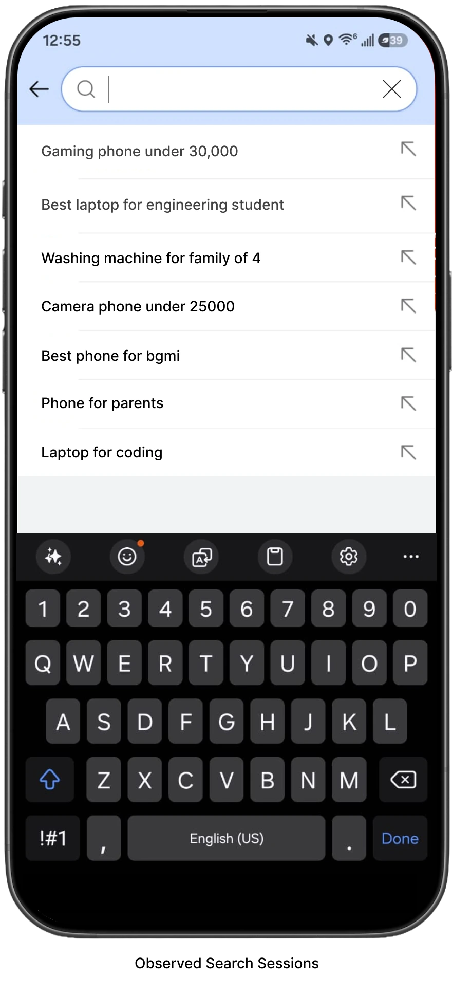
Phone mockup showing intent-based search suggestions such as gaming phone under 30,000 and best laptop for an engineering student

Accountability

What I owned — and what I didn’t.

This was design work on one slice of a very large surface, alongside engineering, data science and category teams. Being precise about the boundary matters more than sounding senior.

I owned

  • The intent model for search entry Defined how a natural-language query decomposes into budget, use case, audience and feature intent — and how each becomes something the shopper can see, confirm and edit rather than something the system silently assumes.
  • Result clustering and its explanation pattern Specified how results group into intent-aligned sets, what each cluster is allowed to claim, and the one-line rationale attached to every recommendation.
  • Comparison and decision support Designed the side-by-side comparison, the attribute hierarchy behind it, and the trust signals that sit next to the choice at the moment it is made.
  • Validation framing Wrote the concept-test tasks, ran the sessions, and set what counted as failure — testing whether people could predict and challenge the system’s reasoning, not whether they liked the layout.
  • The honest-recommendation rules Argued for and specified when the system must decline to recommend, and the language it uses when evidence is thin.

Decisions & tradeoffs

Four decisions that shaped the work.

Each of these had a credible alternative, and each one cost something real. The costs are listed because they were accepted knowingly, not discovered later.

Decision 01 · Query model

Intent expression over keyword purity.

Decision

Treat the query as a statement of intent to be interpreted and made visible — budget, use case, audience, priority attributes shown back as editable chips — instead of a keyword string to be matched literally.

Alternatives considered

Keep literal matching and invest in better filters and query suggestions. Or interpret intent silently in the background and only show the improved ranking.

Why we chose this

Better filters ask the shopper to translate their goal into the system’s vocabulary — exactly the work they were failing at. Silent interpretation performs well until it is wrong, and when it is wrong invisibly the shopper has no idea why the results look odd and no way to correct it. Making interpretation visible turns a model error into a two-second fix.

Cost accepted

The results page now carries a layer of reasoning that has to be read, which slows down the shopper who typed an exact model name. And every interpretation error is on display — deliberately more accountable, and therefore more embarrassing when the model misfires.

Decision 02 · Input model

Multimodal entry, scoped to where it earns its place.

Decision

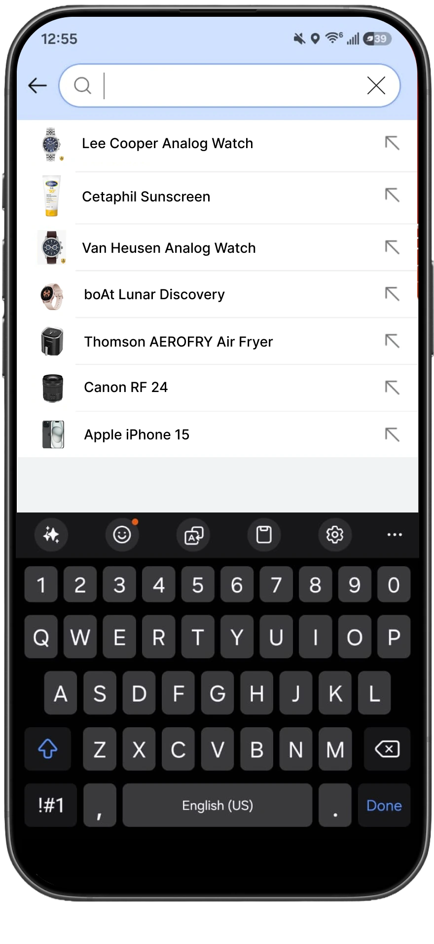
Support image and voice entry as routes into the same intent model — and require every non-text input to resolve into the same visible, editable intent before it returns results.

Alternatives considered

Stay text-only and keep the model surface small. Or build visual search as a separate destination with its own results experience, the way most marketplaces had.

Why we chose this

A photo answers “something like this” far better than a sentence, and voice carries constraints people won’t type on a phone. But a separate visual-search destination fragments the journey and doubles the surface. One intent representation meant one explanation pattern, one comparison model, one place to fix things.

Cost accepted

Image input is the weakest link: strong on category and style, poor on use case, so it needs a clarifying step that makes it feel slower than it looks in a demo. I also accepted a heavier first run — three entry points to explain instead of one. Multimodal parity was the first thing I’d have cut under schedule pressure.

Decision 03 · Results structure

Explained clusters over a longer flat list.

Decision

Group results into a small number of intent-aligned clusters — best overall for the stated goal, best value, strongest on the attribute the shopper prioritised — and attach a short, specific rationale to each cluster and each top recommendation.

Alternatives considered

Keep the flat list and improve ranking quietly. Or go further and return a single “best” answer with everything else collapsed behind it.

Why we chose this

Better ranking on a flat list is invisible — the shopper still verifies it themselves, so it buys no confidence. A single answer is the opposite failure: it asks for trust the system hasn’t earned, and one bad recommendation poisons every future one. Clusters let the system commit to a point of view while keeping alternatives visible — the shape of advice people actually accept.

Cost accepted

Clustering is only as honest as the catalogue data behind it, and attribute coverage is uneven — which is why clusters degrade to a ranked list rather than invent a distinction. It also pushes products further down the page. The rationale line is the fragile part: written badly it reads as marketing copy and the whole pattern loses credibility.

Decision 04 · Decision support

Comparison deep enough to settle the choice, shallow enough to finish.

Decision

Cap comparison at three products and roughly six attributes, chosen by the stated intent rather than by the spec sheet, with each attribute translated into a consequence — “holds 60fps in long sessions” rather than a chipset name.

Alternatives considered

A full comparison table with every attribute and no limit on products, matching what power users ask for. Or no comparison surface at all, letting the clusters carry the whole decision.

Why we chose this

In sessions, a full table recreated the exact overload people came to escape — they scrolled it and still couldn’t say which product was better for them. Three products kept the comparison legible on a phone, and intent-selected attributes meant the table answered their question instead of listing everything the catalogue knew.

Cost accepted

Expert shoppers hit a ceiling and still want the full sheet, so we kept a path to it and accepted it is worse than a purpose-built table. Selecting attributes by intent also means the system decides what matters — real editorial power, and the place where a wrong call is most damaging because it is least visible.

The solution

Say what you meant.
See why these.

One loop, four moves. The shopper states a goal, sees how the system understood it, reads results that are grouped and explained, and settles the choice in one place.

  1. 01

    Express

    Type, speak or photograph the goal — in the shopper’s own words.

  2. 02

    Confirm

    Budget, use case and priorities come back as editable chips before anything is ranked.

  3. 03

    Understand

    Results arrive in intent-aligned clusters, each carrying a reason it exists.

  4. 04

    Decide

    Three products, the attributes that matter for this goal, and the trust signals beside them.

Before
Before: a flat, unranked list of phone results with no grouping or explanation

A long, flat list. Every product looks equally plausible, relevance is unstated, and the whole evaluation is offloaded onto the shopper.

After
After: intent-aligned result clusters with short rationales and a focused comparison surface

Interpreted intent at the top, clustered results underneath, and a rationale on each recommendation — so the shopper can agree, disagree, or correct the system in one tap.

The visible difference is structure. The real difference is that the second screen can be argued with.

AI product rigor

Designing the model’s behaviour, including when it’s wrong.

An intent layer is a product surface with a failure rate. Most of the design work was deciding what the system is allowed to claim, and what it does when it gets the query wrong.

How intent is modelled

  1. Decompose. The query splits into budget, category, use case, audience and priority attributes — each a slot that can be filled, empty or uncertain.
  2. Surface. Every filled slot appears as an editable chip. Nothing influences ranking while staying invisible.
  3. Translate. Use case maps to observable evidence — “gaming” becomes sustained performance, thermals, battery and refresh rate, not a marketing tag.
  4. Cluster. Results group by which part of the intent they satisfy best, so the grouping is itself an explanation.
  5. Justify. Each recommendation carries a short reason tied to the stated goal, drawn from attributes and review evidence rather than generic praise.

Where it fails

  • Ambiguous or mixed intent. “Good phone for my mother” carries an audience and no attributes. The system asks one clarifying question rather than guessing an answer it would then have to defend.
  • Thin catalogue data. If evidence for a claim isn’t in the attributes or reviews, the cluster degrades to a ranked list. The rule I pushed hardest for: no rationale beats a fabricated one.
  • Image input without use case. A photo gives category and style, rarely purpose — so visual entry always routes through intent confirmation before ranking.
  • Over-narrow interpretation. Confident wrong parsing is worse than vague parsing, so chips are removable and the unfiltered result set is one tap away.
  • Commercial pressure. A rationale slot is an attractive place for a sponsored message. Keeping it strictly evidence-derived is a policy decision, not a visual one — and it needs an owner after launch.

How the concept was evaluated

I tested whether people could predict and challenge the system’s reasoning — not whether they preferred the new screens. Preference tests on a redesign tell you almost nothing.

Method 01

Query analysis

Sampled real intent-led queries to establish how often budget, use case and audience appeared, and which the existing system could act on. This set the ceiling on what an intent layer could realistically improve.

Method 02

Concept tests

Moderated sessions on the clustered, explained results against the flat-list baseline, using shoppers’ own recent purchase goals so the task carried real stakes rather than a scripted scenario.

Method 03

Usability & trust probes

Deliberately showed weak and wrong recommendations to see whether people noticed, corrected the chips, or quietly disengaged — the behaviour that predicts whether an AI surface survives real traffic.

What this testing did not cover

Concept testing tells you whether people understand and accept the reasoning in a session. It does not tell you what happens to trust after a bad recommendation on a real purchase, or how the pattern holds up across categories with much weaker catalogue data. Those are the two studies I would run before defending this in production.

Impact

What this work actually produced.

I’d rather be precise than impressive. This engagement produced a research-grounded case for change, a validated interaction model, and a set of reusable patterns — and it is worth being exact about which is which.

01 — Research-grounded opportunity

Query analysis and session observation turned “search could be smarter” into a specific, sized problem: intent-led queries dominate the categories we looked at, a minority of returned products strongly match that intent, and shoppers spend minutes rebuilding the same comparison by hand. That framing moved the conversation from ranking tweaks to an interpretation layer.

  • 34%

    of results strongly matched intent

    Research observation — query analysis

  • 8–12 min

    spent manually comparing

    Research observation — session study

  • 5–7

    products opened before deciding

    Research observation — session study

02 — Concept validation outcomes

In moderated sessions against the flat-list baseline, clustered-and-explained results were preferred, participants more readily stated which product suited their goal and why, and self-reported decision confidence was higher. These are directional signals from a small qualitative sample — they establish that the model is understandable, not that it moves revenue.

  • Preferred

    clustered results over the flat list

    Concept validation — qualitative, small sample

  • Clearer

    task articulation of “which one and why”

    Concept validation — moderated sessions

  • Higher

    self-reported decision confidence

    Concept validation — self-report, not behavioural

03 — Design-system outcomes

The most durable output was a set of patterns other teams could pick up without re-litigating the reasoning: a trust-signal set with rules for when each signal appears, a cluster model that degrades to a ranked list when data is thin, and an explanation pattern with an evidence requirement attached. These survive whether or not this flow ever ships.

  • Signals

    Ratings, verified reviews, seller reliability, returns and delivery confidence — with placement rules

  • Clusters

    Intent-aligned grouping with a defined graceful degradation path

  • Explanations

    Rationale pattern with an evidence requirement and a no-claim fallback

How to read this section

Nothing here is a Flipkart production A/B result. I didn’t own instrumentation or experiment design, so I claim no shipped conversion, click-through or return-rate movement — and I’d be sceptical of any portfolio that did without naming the experiment. What I will defend in detail is the reasoning behind each decision above, the costs I accepted, and what I’d measure first if this went live.

Senior reflection

What I’d challenge next.

The parts of this work I’m least satisfied with are the parts I’d start with if I picked it up again.

  1. I designed the confident case first

    Most of my exploration assumed the intent model parsed the query well. The harder and more common state is partial understanding — budget clear, use case vague — and Decision 01 made that state more consequential, not less. It belonged in the first round of concepts, not a later refinement.

  2. Catalogue data is the real ceiling, and I treated it as background

    Explanation quality is bounded by attribute coverage, which varies enormously by category. I designed a graceful fallback but never pushed for the coverage audit that would have told us which categories could support this at all — a prioritisation input I should have produced rather than a risk I noted.

  3. I should have agreed the measures before the screens

    Because I designed first and looked for evidence second, the honest impact story here is qualitative. Defining up front what “decision confidence” counts as behaviourally — fewer products opened before purchase, fewer returns citing wrong-fit — would have sharpened the tradeoff conversations and let me speak about outcomes with more authority.

  4. The commercial tension is unresolved

    A recommendation surface with an explanation slot is valuable inventory, and “the rationale must be evidence-derived” is only a rule while someone defends it. I wrote the principle; I didn’t design the governance that keeps it true a year after launch — the part most likely to decide whether shoppers keep trusting it.

The hard part of AI discovery isn’t returning better results. It’s giving someone a reason to believe the ones they’re looking at — and a way to argue back when they don’t.